Boooooo’s AR Cereal
AR packaging concept inspired by Meow Wolf's Omega Mart, WINTER 2022
Summary
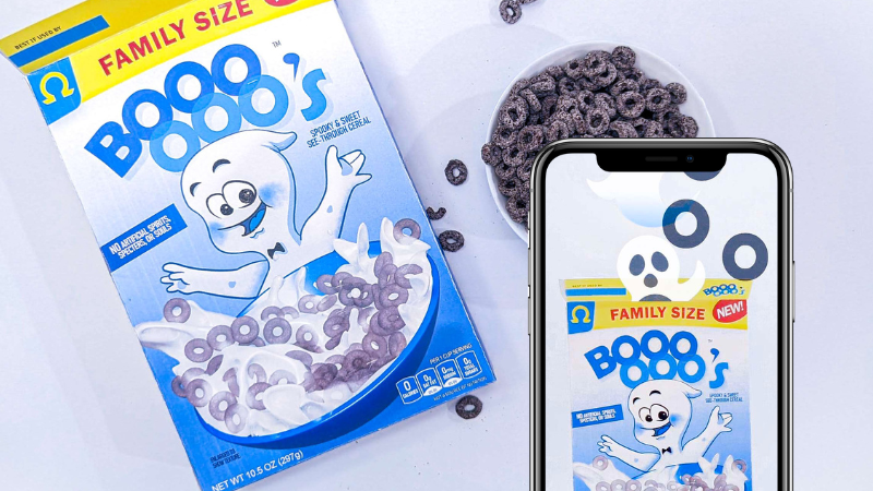
Product design concept and AR activation for “Boooooo’s” transparent ghost-themed kid’s cereal. Created over the two months following my visit to Meow Wolf’s Omega Mart exhibit in Las Vegas.
Involved 3D sculpting, texturing, and rendering the bowl of cereal, designing and drawing the ghost mascot, creating the vector logos and iconography that decorate the box, copywriting, optimizing files for printing, assembly, and putting together the AR filter.
Inspiration and Concept
Shortly following my college graduation I had the chance to visit the Omega Mart exhibit by Meow Wolf in Las Vegas. Omega Mart is an immersive art space based on an alien grocery store, filled with offbeat versions of typical consumer products such as “5G lip balm,” “vegan goat pus lemonade,” or “nut-free peanuts.” Needless to say I was incredibly inspired and left the shop determined to become an exhibit artist–or at the very least try my hand at my own Omega Mart brand product.
After brainstorming a few concepts I settled on the idea of “Boooooo’s,” transparent cereal loosely based on Oreo O’s except spooky, see-through, and supernatural. I also had the idea of pairing the cereal with an interactive AR filter that could make ghosts float out from the box.
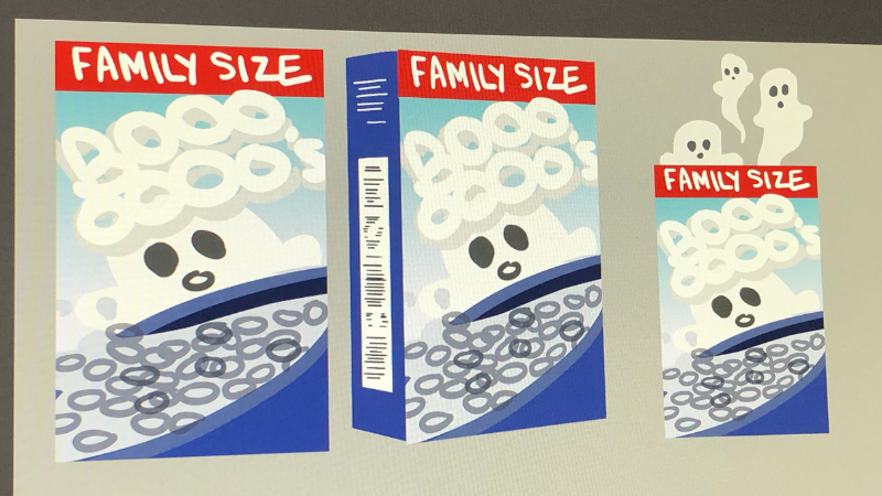
Also as a fun way of measuring my active time spent on this project, I decided I would only listen to Taylor Swift’s Midnights 3 AM Version while working and count up how many times I’ve replayed the album at the end. To start us off, I’ve played Midnights two times now.
Midnights Counter: +2
Cereal Bowl Render
As I was sketching I realized a few things that would be roadblocks in the creation of this project, the main issue being the render of the cereal bowl. I was originally thinking about either finding a stock image or buying a box of Oreo O’s from my local HEB and photographing the splash myself but I realized that simply dropping the opacity of an image for the transparency on the cereal pieces wouldn’t look right since the whole thing would be solidly transparent without accounting for the overlapping cereal.
I also considered photographing everything individually and collaging it together in Photoshop but it seemed like a lot of work for something that I couldn’t see turning out as cleanly and realistically as I would like. I realized my best bet would be to model and light the cereal myself and render out the image with transparency.
I first attempted to run a fluid simulation for the milk splash to get a base for my scene but Maya crashed a solid three times until I gave up and decided to try sculpting the milk instead.
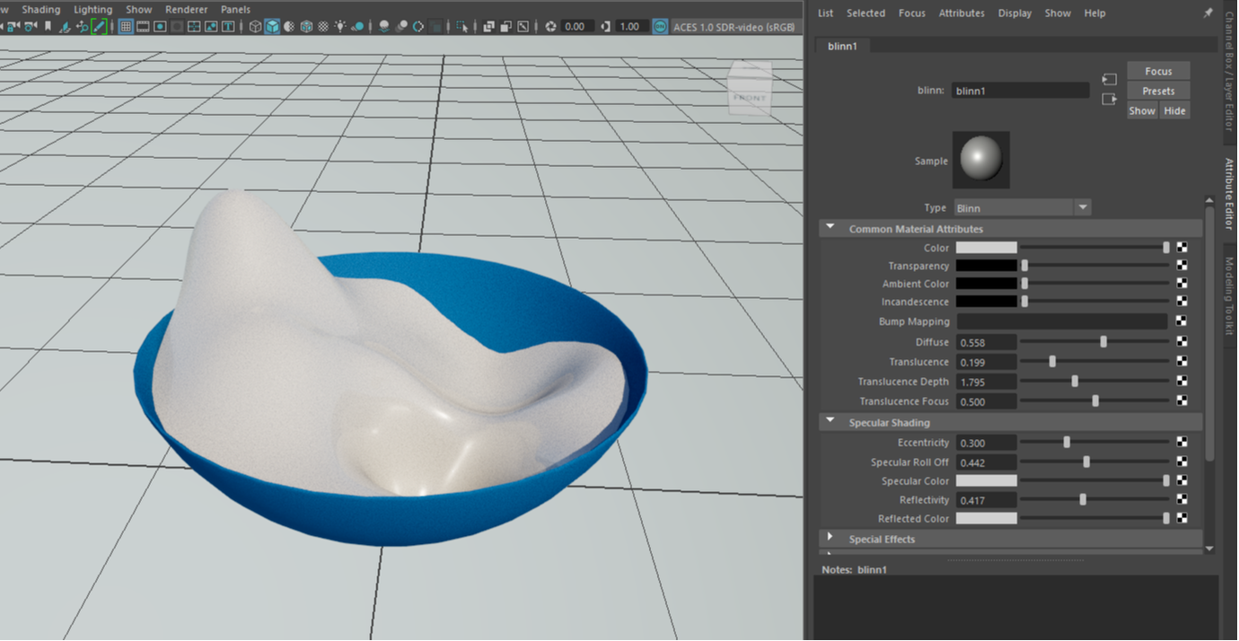
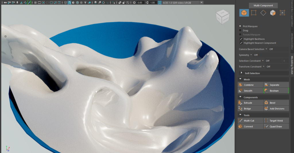
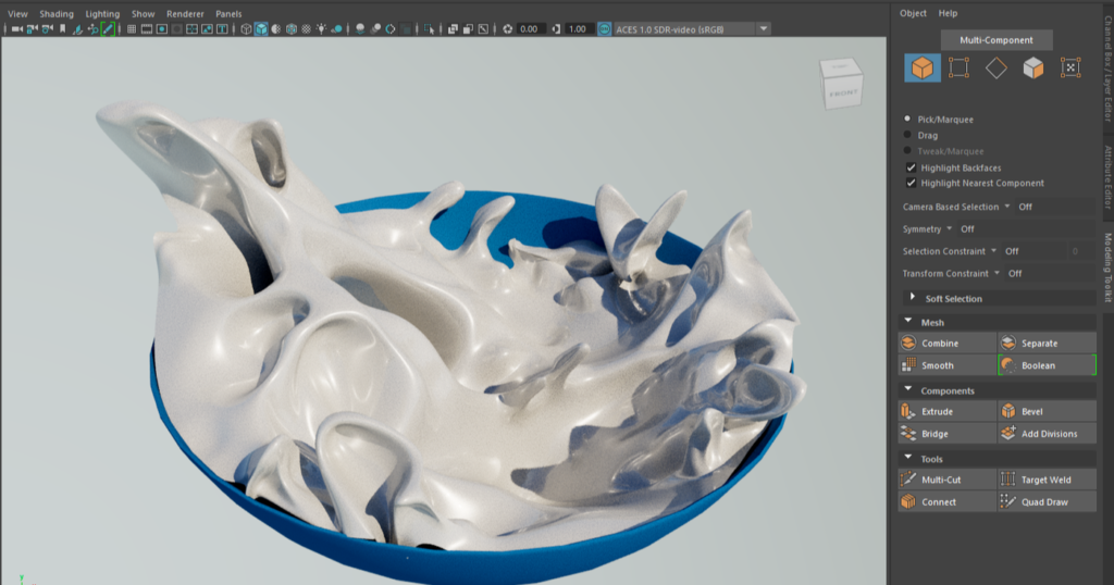
I struggled a bit at first with getting the milk to not look solid or like whipped cream, but after studying some references I realized that the realism was mostly from adding tight details that suggested that the fluid was able to fold more since it was thinner and runnier. It took some trial and error but I began to try and think about sculpting the milk as if I was sculpting fabric, and envisioning the way the surface would crease, bend, and fold.
I then hand placed the O’s to get the perfect composition and imported their textures in from Substance Painter and attempted my first render which just didn’t work for some reason.
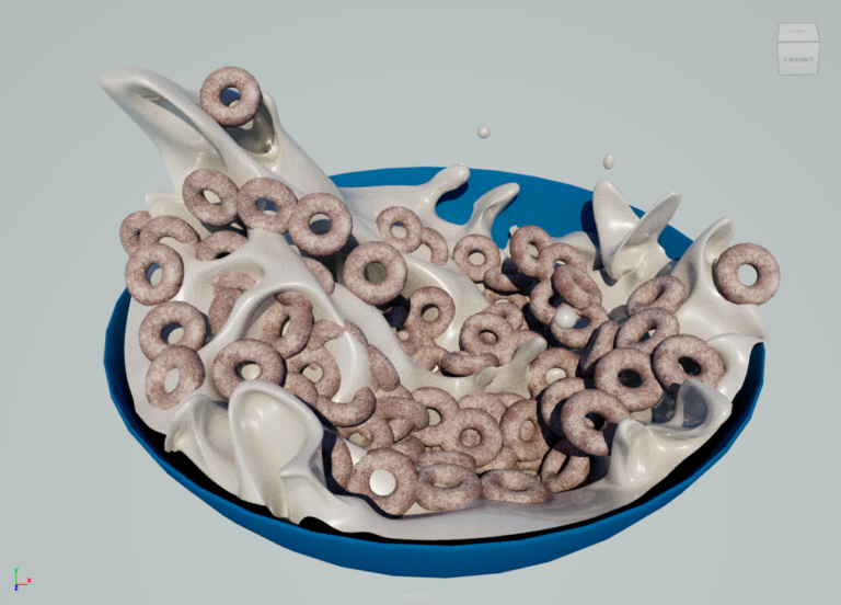
Honestly, I’m still not entirely sure why because I opened the file on a different computer and it rendered out fine and is actually the file you see on the finished version.
Midnights Counter: +3
Mascot
I don’t get a lot of opportunities to use my illustration skills these days so this part of the project was a nice change of pace. Designing a believable cereal box mascot honestly proved to be a lot more complicated than I expected, purely because of the careful attention to detail I had to pay to the design language used in modern cereal mascots. Note that I specified “modern.”
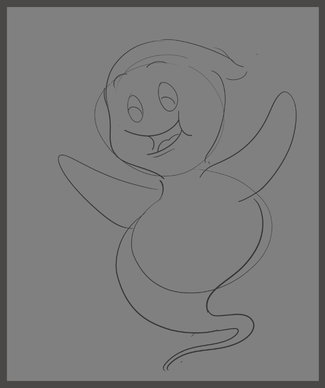
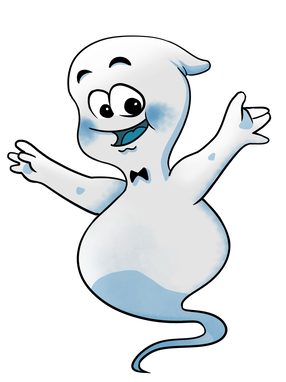
When I made my first sketch and drawing of Boooooo I referenced the shading, line art, and design styles used for vintage cereal boxes as well as Casper the Friendly Ghost, another vintage character. But as I was wrapping up I realized that many modern mascots have a completely different style (thinner lines, gradiented/airbrushed shading, versus hard shadows/rough watercolor brushes).
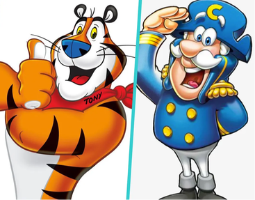
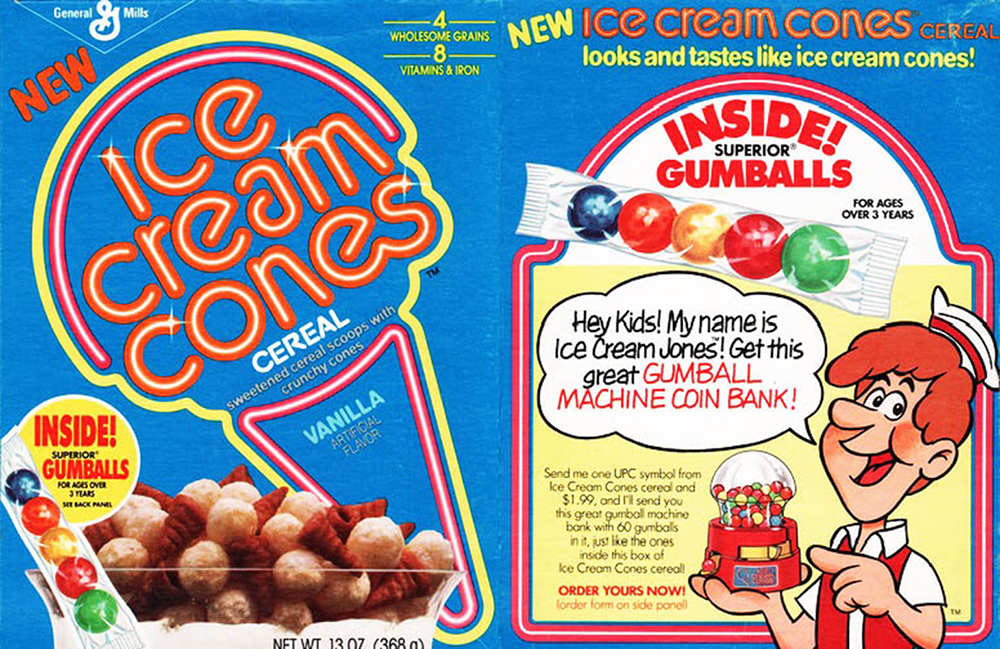
My perfectionist brain began freaking out upon noticing this because I was really worried that Boooooo would look incredibly out of place on a modern looking cereal box design. I told myself that I had to keep moving and that if it still looked strange once I had all of the elements together that I can go back and “fix” it. But thankfully I was pretty happy with the end result and decided to keep it.
Also, just for funsies, here’s also a quick comparison of my original base sketch for Boooooo compared to the final box art version.
Midnights Counter: +2
Box Art
I iterated on the Boooooo’s logo several times before setting on the final bright blues and overlapping text version.
The original logo was an edited font that I hand placed the letters for to try and get that spooky shaky ghost feeling, and while I liked the look, I felt like it wasn’t bright or fun and simple enough to be a cereal box logo. I think it was a nice design but the wrong direction I wanted to take the project.
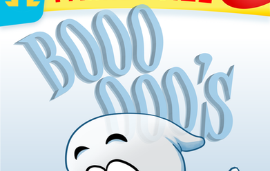
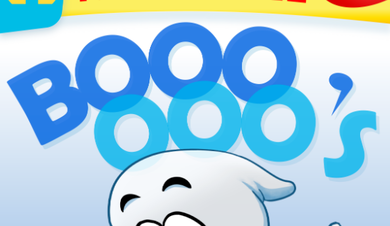
I wanted to allude to the transparent cereal more through the design of the logo as well as having the shape of the O’s actually resemble the shape of the cereal, so I went with a much bolder font and color choice with circular O’s, overlapping the two rows to show off the transparency. The biggest thing I liked with the old logo was the look of the apostrophe so I stole it back for the final version.
Midnights Counter: +2
I didn’t really have any concept art or preexisting idea of what I wanted the other sides of my box to look like so honestly there isn’t much to report on for this other than that it was a lot of just plopping stuff down and scooting it around based on intuition. “Would this look better with a drop shadow? Ooh nice, let me keep that! And what if I made the background a slight gradient? That’s great, I’ll roll with it. Don’t kids cereal boxes have some sort of activity on the back? Guess I’ll look up a maze generator online–hope this isn’t plagiarism!”
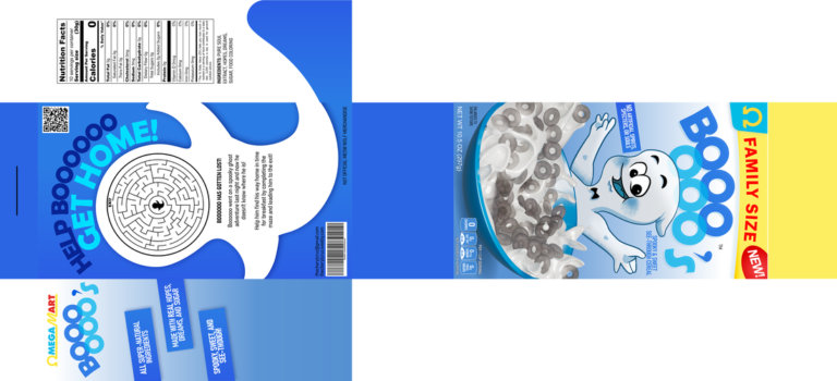
As you can see, I was really dumb and didn’t actually design my box to the specs of an actual cereal box so I spent an afternoon reorienting everything to fit the 12x8x2.5 dimensions which I should have done from the beginning but ah well–it’s fixed now!
Midnights Counter: +3.5
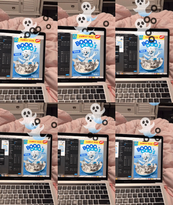
AR Filter
I cannot begin to describe the amount of motivation it took to get me to do this last part. I told my friend to remind me to do it and to berate me if it wasn’t complete by the time they got off work which was just the kick in the pants I needed.
I tried many complicated ways to mask the origin of my emitters that did not work (extracted camera texture, object segmentation, etc.) before I learned that if you want to hide an object behind a transparent image you can just drop that image’s opacity to zero and it’ll continue to mask it. SO EASY and I can’t believe it didn’t occur to me sooner.
I messed with the emitter settings a ton between pushing the effect to Instagram to test it out. Just a lot of tweaking to get it to read like the particles were actually coming out from behind the cereal box cover.
Midnights Counter: +3
Taylor Swift Midnights 3 AM Version Final Count: 15.5 hours; Unaccounted time: researching, finding references and tutorials, getting feedback, printing and assembling.